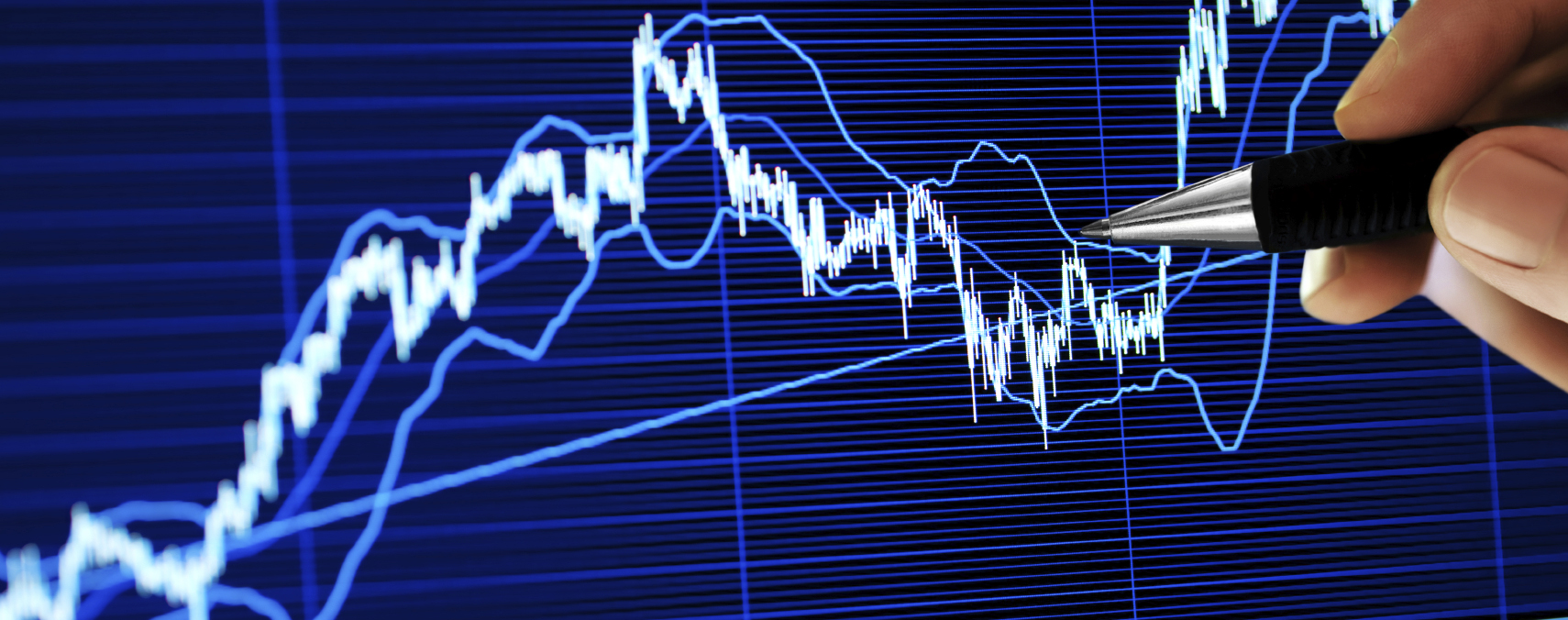
Communication has become more visual than ever before. Just look at Instagram, Facebook, Twitter’s world of 280 character tweets, and now TikTok. The chart remains an effective way to visually communicate data, and almost anyone with access to charting software, such as MS Excel, can easily create one. But while charts can be valuable tools to help present data as compelling stories, charts can also mislead.
Financial experts use charts to present complex financial data to non-specialists in an easy-to-grasp and understandable manner. However, it takes only one poorly created chart to change the narrative. Studies show that non-specialists (people with minimal levels of financial understanding) stand a greater chance of being misinformed by incorrect or misleading charts. The many ways that a bad chart can be constructed includes: biased labeling; missing data points; misused chart types; and 3-D charts. In this article, I discuss the impact of incorrectly setting the range and scale of a chart’s y-axis — the vertical axis that intersects with the horizontal axis to create the coordinate plane of a chart.

Scale
The bar chart presents categorical data using rectangular bars with heights or lengths proportional to the values they represent. The scale on the y-axis is the units into which the axis is divided. In most cases, the baseline of the bar chart should begin at zero so each bar represents its respective proportional value. As correctly shown in the example below, reported sales for years 2017, 2018 and 2019 were $50.0 million, $55.0 million and $60.0 million, respectively. The growth depicted between years 2017, 2018 and 2019 appears minimal, reflecting a 9.5% compound annual growth rate (CAGR) for the period.

However, a much different and more dramatic story is communicated when the scale on the y-axis starts at an amount greater than zero, shown below. Beginning the baseline of the y-axis at an amount other than zero is known as a truncated chart. In the truncated chart below, the sales growth now appears much more significant. Warning: MS Excel will default to a truncated chart when the subject data values being used are within a close range.

Removing the scale from the y-axes, as shown below, now makes the truncated chart undetectable. Accordingly, both of these charts are misleading because the scales are not shown.

Truncated charts can create an illusion of significant change when change is relatively unnoticeable. To best illustrate change over time, the line chart can be used; it displays information as a series of data points connected by straight line segments. Unlike the bar chart, the y-axis of the line chart does not need to begin at zero, as shown below.

However, changing the y-axis maximum value can affect appearance. For example, a higher maximum value will cause the line chart to appear less volatile than using a lower maximum value. Compare the chart below to the chart above. In the below chart, the scale begins at 0 and extends to 100, which is obviously disproportionate to the underlying data when compared to the chart above; it begins at 72 and extends to 86. The chart below uses a higher maximum value and shows less volatility than the chart above.

Ratio
A chart can easily be resized in most charting programs. For example, in MS Excel, simply drag the sizing handles to manually change a chart’s size and dimensions. However, changing the ratio of a chart’s overall dimensions can visually affect its appearance. Compare the three charts below, all of which share the same data and scale, which means that the actual slope of the data is the same. Notice that the angle of the line on each chart is dramatically different.


Summary
Whether they occur intentionally or accidentally we cannot stop the creation of bad charts. Hopefully this introduction to misleading charts can help spot one, should it surface.
To conclude, here is a chart that I created in a recent lost-profits matter; I believe it demonstrates the correct way to create a chart. Although I did not rely solely on this chart to convey my opinions to the Court, I know the visualization told a clear, accurate story. I calculated damages on behalf of the Plaintiff who was awarded a multi-million-dollar verdict.

Contact Brian, an REDW Principal and Business Valuation Practice Leader, at 602.730.3672 for questions about business valuation or to discuss a project.
This article will appear in the March 2020 issue of Arizona Attorney Magazine.


